Skip to content

Foxplus

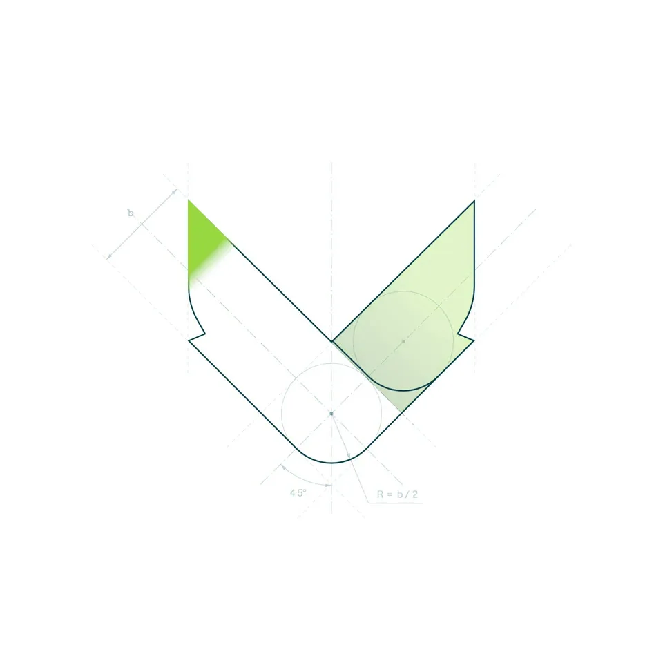
There are many foxes. From the “Bausparfuchs” to the “Waschmittelfuchs,” the animal is a constant presence in advertising. The goal, therefore, was not just another fox, but a symbol embodying the spi

The answer: an abstract fox’s head. Minimalist, straightforward, distinctive—clever, without being cute.
Analyze. Optimize. Implement. Now with a face of its own.

Year
2026
Services
UX/UI, Branding
Close
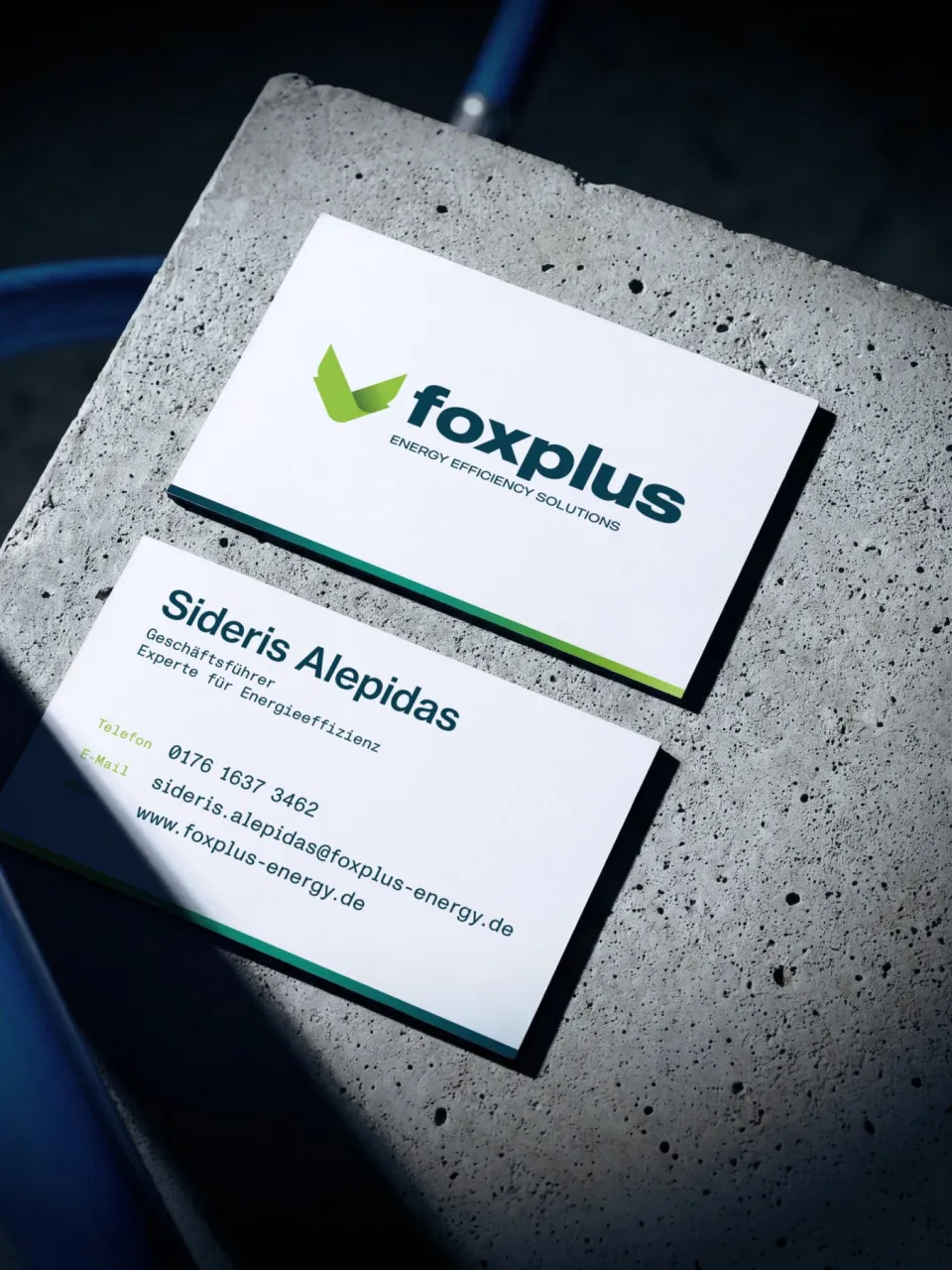
foxplus: two business cards on a concrete block – front with the logo, back with the contact details of Sideris Alepidas, managing director
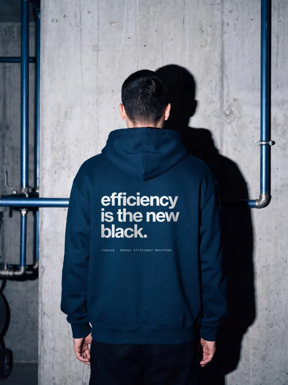
foxplus: dark blue hoodie seen from behind with the print “efficiency is the new black.” and the line “foxplus · Energy Efficiency Solutions”, in front of a concrete wall with blue pipes
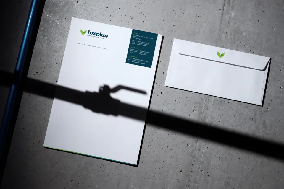
foxplus: letterhead with logo and petrol-coloured contact block next to an envelope with the mark, on concrete, with the shadow of a ball valve across it
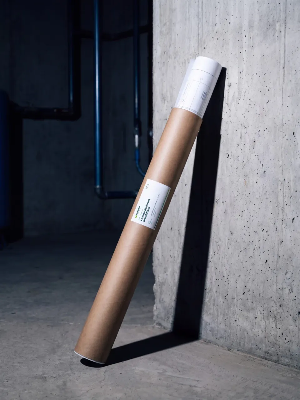
foxplus: drawing tube labelled “Leckage-Kartierung Druckluftnetz”, leaning against a concrete wall with blue compressed-air pipes behind
foxplus: leak tag no. 017 fixed with a cable tie to a blue compressed-air pipe next to a ball valve, with fields for date, plant, size and sound level
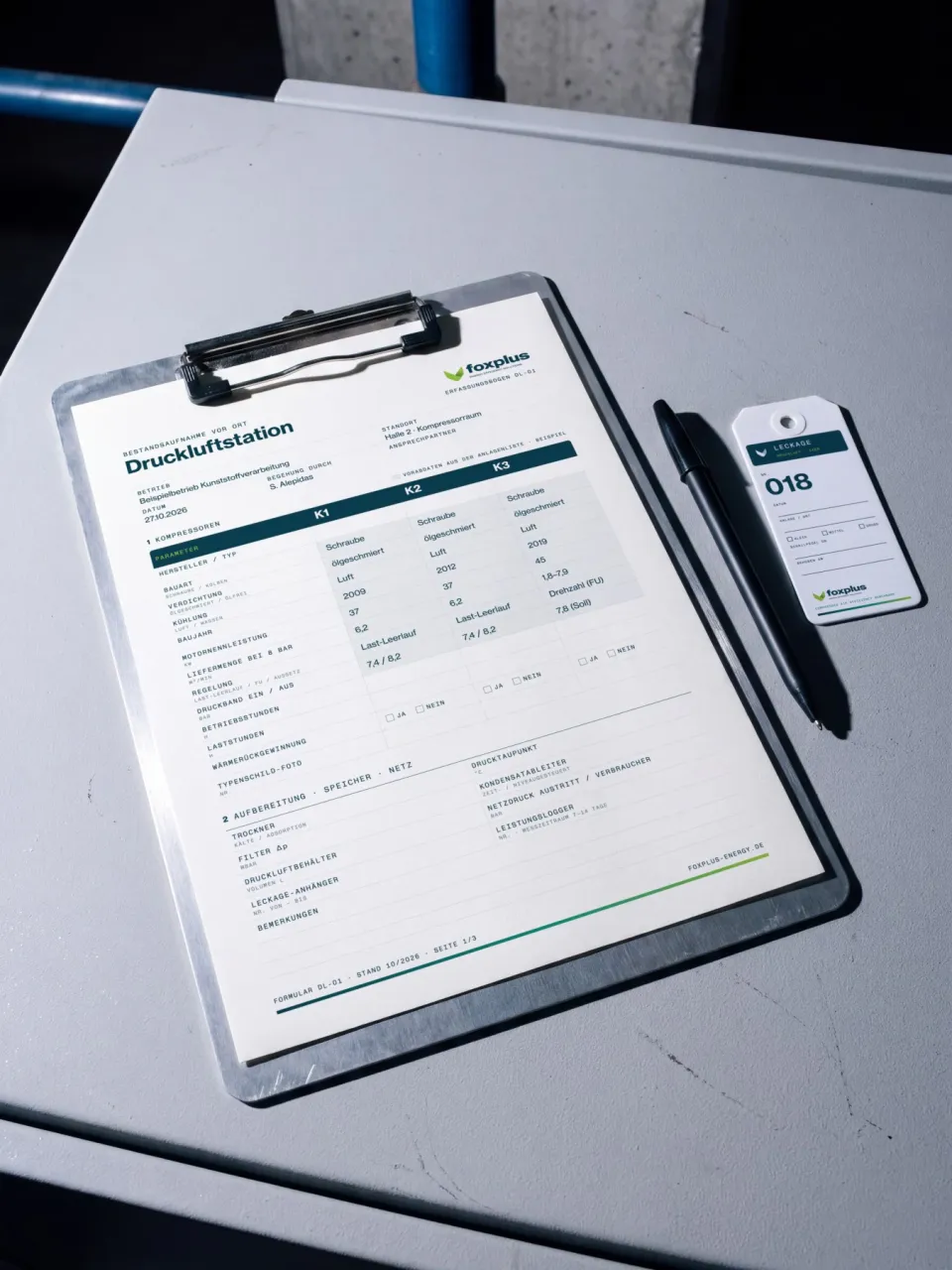
foxplus: clipboard with survey form DL-01 “Bestandsaufnahme Druckluftstation”, next to it a pen and leak tag no. 018
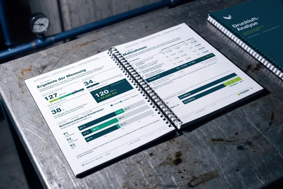
foxplus: open spiral-bound report “Druckluft-Analyse” with measurement results, operating states per compressor and a table of measures, the cover beside it