PADEL72
Off the Wall.
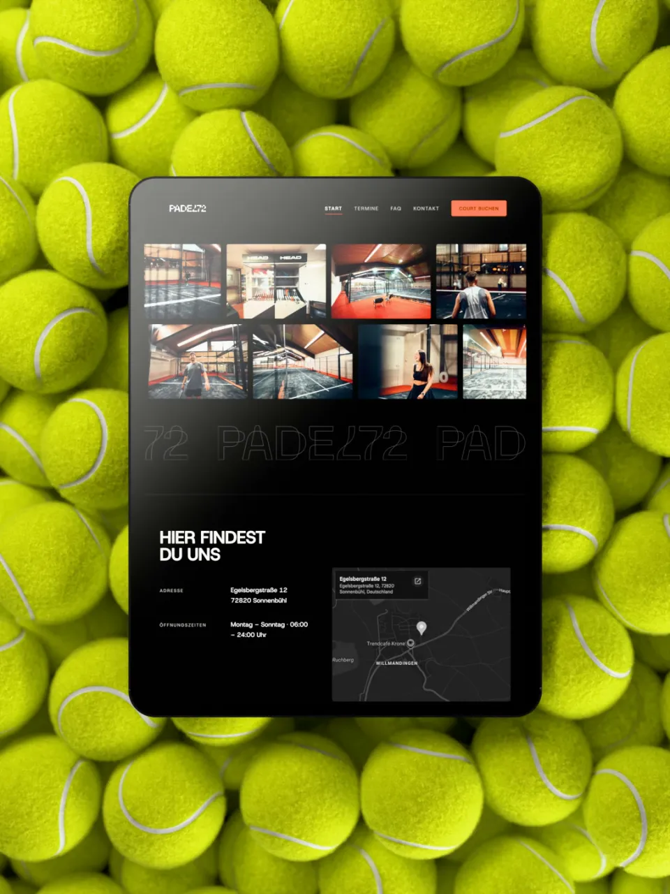
Logo, branding, website and ad creatives for the first padel venue on the Swabian Alb – in black, white and orange instead of the usual neon green.
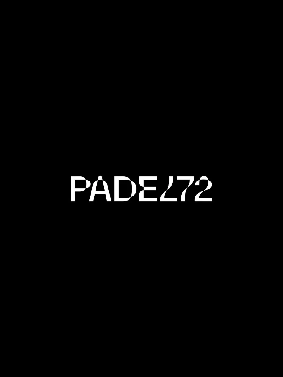
Padel brands love neon green, rackets and court lines. PADEL72 takes a different angle. Black, white and a loud orange carry the identity, the wordmark is built from segments – and its 7 is an L turned upside down. Two sides, one game. Online, the headline rises step by step, and the cursor leaves an orange trail. Neon yellow is reserved for the ball.
- Year
- 2026
- Services
- Branding, UX/UI, Ad Creatives
- Client
- PADEL72